How do CSS pixels work?
Let’s start off with px and pt Link to heading
You’ve probably seen the units px and pt before in CSS. If you didn’t know, px stands for pixel unit and pt stands for point.
The units px and pt are related. 1px is always equal to 0.75pt, just like how 1 inch is always equal to 2.54 cm.
Also, 1pt is equal to 1/72nd of 1 inch, meaning that 1px ends up about 0.265mm. Great!
What’s the problem? Link to heading
The problem is that the mm unit in CSS isn’t equal to the SI millimetre distance unit that we use everywhere else. Same with cm and in.
Why?
Let’s pretend it was equal. Say that one mm in CSS was equal to exactly one millimetre in distance. Let’s also say we were drawing a line on the screen with width 10px. Since one px equals 0.265mm, this line would be 2.65 millimetres wide.
But: the line would be drawn using a different numbers of physical pixels by each device. This is because different devices have different pixel densities (measured in DPI). How many pixels are needed to draw the line? That depends on the DPI of the device.
Let’s say we have a device with 160 DPI, or in other words, 160 pixels fit in one inch. Now one inch is equal to 25.4mm, so this means 160 pixels fit in 25.4mm. We want a line 2.65mm wide, so we would need to use ((2.65)/ (25.4)) x 160 = 16.69 pixels to draw the line.
But wait! This is a fractional number of pixels. That’s not good. I guess we have to round to an integer value. That’s okay, right?
But try this: what if each pixel on our screen was bigger than 0.265mm? What if we have a 1px border, that after all the calculations above, ended up as less than half a pixel? It’d disappear. And that’s not good. Just ask this guy.
To solve the problem, each browser sets the size of the px unit. After, the size of all other units are determined, based on their relationship with the px unit. This is called anchoring the system of units.
The system could have also worked by the browser setting the size of a length unit (like the cm unit), and then having everything work relative to that. But, then we’d run into the pixel rounding problem again.
So how big is 1px? Link to heading
Each device chooses how big 1px is. This means that they choose how many physical pixels are used to represent 1px in CSS.
That leads to the obvious question: how many physical pixels should a browser choose? Let’s try a few options out and start with the obvious: a one-to-one mapping.
What about making one physical pixel equal 1px? Link to heading
The problem with this is that every device has a different pixel density. The layouts styled by CSS should look the same, regardless of the DPI of the device. Under this system, higher density devices would have smaller layouts. So this is no good.
What about making 1px equal 0.265 CSS millimetres? Link to heading
It’s a nice idea. We had from before that 1px is 0.265 CSS millimetres. If we did this, the CSS millimetre would be as close as possible to the length-unit millimetre.
So what if 1px was equal to the closest number of pixels possible to 0.265mm. For our example above, that’d be 17 screen pixels. What would this mean?
Imagine we had some text at size 18pt. This corresponds to 24px, which would make our text equal to 6.36mm. On every screen. Regardless of size. What if we had a massive screen, as big as a wall? What if we had a tiny screen?
So that’s no good either. We need a solution that scales with the size of the screen. In other words, 1px should have more physical pixels on a bigger screen than on a smaller screen.
The reference pixel was introduced by the CSS standard authors to fix this problem.
The reference pixel Link to heading
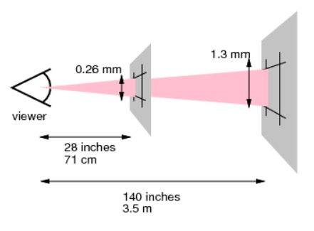
You might not have thought about this much, but you look at smaller screens from a closer distance, and larger screens from a larger distance.
Mobiles, you hold them right up close. Laptop screens, a bit further back. Large monitors, further away; TVs, even further. For huge projector screens, you’ll push towards the far side of the room.
The reference pixel is a pixel that scales in size. It scales based on how far away you look at it from, which in turn is based on the screen size. So the reference pixel is bigger for bigger screens, smaller for smaller screens.
Finally Link to heading
We can finally say what 1px is. It’s the number of physical device pixels, rounded to the nearest integer, that makes 1px as close as possible to the reference pixel size.
The px is smaller on smaller screens, bigger on bigger screens. It’s worth more device pixels on higher DPI screens than on lower DPI screens.
And that’s it.
Source Link to heading
This fine article has the information for most of the things in this post.