A quick overview of Seaborn
Seaborn. A wrapper on top of matplotlib. Used to make plots, and to make them quicker, easier, and more beautiful.
Thank you for your service, matplotlib. Despite your flaws, you’ve guided us this far.
But it’s time to step aside.
Types of Seaborn plots Link to heading
sns.boxplot()| generic boxplotsns.distplot()| histogram and kernel density estimate (KDE) plotted togethersns.distplot(rug=True)| rugplot
sns.kdeplot()| kernel density estimate plotsns.kdeplot(n_levels)| set the n_levels parameter high to make the KDE finer
sns.rugplot()| rugplot againsns.jointplot()| show a scatterplot and marginal histogram for two-dimensional data.sns.jointplot(kind='hexbin')| hexbin plot, like a two-dimensional histogram.sns.jointplot(kind='kde')| two-dimensional KDE (might take a while to plot for large datasets).sns.jointplot(kind='reg')| scatterplot, regression line and confidence interval. Thesns.jointplot()function returns aJointPlotobject, which you can exploit by saving the result and then adding to it whatever you feel like. Some examples:
# Save the JointPlot
g = sns.jointplot(x="x", y="y", data=df, kind="kde", color="m")

# Use plot_joint to add a scatter plot overlay
g.plot_joint(plt.scatter, c='w', s=1)

# Or a regression line:
g.plot_joint(sns.regplot)
sns.pairplot()| used for exploring the relationships between variables in a data frame. By default, plots a scatterplot matrix on off-diagonals and histograms on diagonals. Similar to the R functionggpairs()in the GGally package.- Similar to how
jointplot()returns aJointGrid,pairplot()returns aPairGridwith its own set of methods available to it. You can use this to change what graphs are plotted:
- Similar to how
# Store the PairGrid object
g = sns.PairGrid(iris)

# Change the plots down the diagonal
g.map_diag(sns.kdeplot)

# Change the plots down the offdiagonals
g.map_offdiag(sns.kdeplot, cmap="Blues_d", n_levels=6)
sns.stripplot()| Like a scatterplot, but one of the variables is categoricalsns.stripplot(jitter=True)| stops the points from overlapping as much
sns.swarmplot()| beeswarm plot that works like stripplot() above, but avoids overlap entirely.sns.swarmplot(hue)| set thehueparameter to use colour to distinguish levels of a variable e.g. blue for male, red for female
sns.violinplot()| draw a violinplot with a boxplot inside it.sns.violinplot(hue, split=True)| if thehuevariable has two levels, then you can spit it so the violin plots won’t be symmetricalsns.violinplot(inner='stick')| show the individual observations inside the violin plot, rather than a boxplot
sns.barplot()| standard barplot, complete with bootstrapped confidence intervalssns.countplot()| histogram over a categorical variable, as opposed to the regular histogram which is over a continuous variablesns.pointplot()| plot the interaction between variables using scatter plot glyphs:
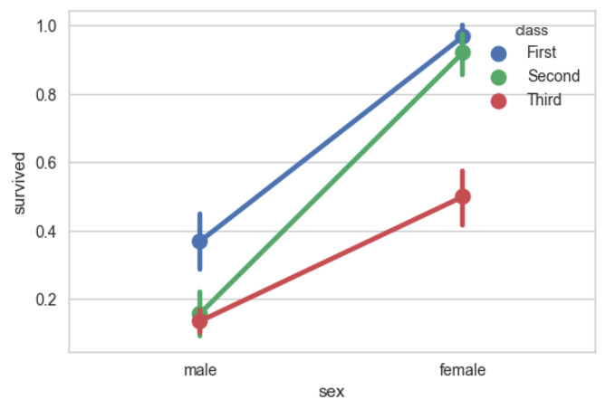
A example pointplot using the Titanic dataset.
sns.factorplot()| draw multiple plots on different facets of your data. Combines plots (like the ones above) with aFacetGrid, which is a subplot grid that comes with a range of methods.sns.factorplot(kind)| specify the type of your plot. Choose betweenpoint,bar,count,box,violinandstrip.Swarmseems to work too, at least according to the official tutorial (use a Find search to find the example)
sns.regplot()| plot a scatterplot, simple linear regression line and 95% confidence intervals around the regression line. Accepts x and y variables in a variety of formats. Subset ofsns.lmplot()sns.lmplot()| likesns.regplot(), but requires a data parameter and the column names to plot specified as strings.sns.lmplot(x_jitter)| add jitter in the x-direction. Useful when making plots where one of the variables takes discrete values.sns.lmplot(x_estimator)| instead of points, plot an estimate of central tendency (like a mean) and a rangesns.lmplot(order)| fit non-linear trends with a polynomial (applies to regplot too)sns.lmplot(robust=True)| fit robust regression, down-weighing the impact of outlierssns.lmplot(logisitic=True)| logistic regressionsns.lmplot(lowess=True)| fit a scatterplot smoothersns.lmplot(hue)| fit separate regression lines to levels of a categorical variablesns.lmplot(col)| create facets along levels of a categorical variable
sns.residplot()| fits a simple linear regression, calculates residuals and then plots themsns.heatmap()| takes rectangular data and plots a heatmapsns.clustermap()| hierarchically clustered heatmapsns.tsplot()| time series plotting function. Has the option to include uncertainty, bootstrap resamples, a range of estimators and error bars.sns.lvplot()| letter value plot, which is like a better boxplot for when you have a high number of data points
Miscellaneous functions Link to heading
sns.get_dataset_names()| list all the toy datasets available on the Seaborn online repositorysns.load_dataset()| load a dataset from the Seaborn online repositorysns.FacetGrid,sns.PairGrid,sns.JointGrid|grids of subplots used for plotting, each somewhat different and each with their own set of methodssns.despine()| remove top and right axes, making the plot look better
Controlling aesthetics Link to heading
sns.set()| set plotting options to seaborn defaults. Can use to reset plot parameters to the default values.sns.set_style()| change the default plot themesns.set_context()| change the default plot context. Used to scale the plots up and down. Options arepaper,notebook,talkandposter, in order from smallest to largest scale.sns.axes_style()| temporarily set plot parameters, often used for a single plot. For example:
Working with colour Link to heading
sns.color_palette()| return the list of colours in the current palette- The
hlscolour palette is one option; see the list of colours withsns.palplot(sns.color_palette("hls", 8)). - Another (better) option is the husl system; see the list of colours with
sns.palplot(sns.color_palette("husl", 8)) - Use
Pairedto access ColorBrewer colours:sns.palplot(sns.color_palette("Paired")). Likewise you can put in other parameters; for example,sns.palplot(sns.color_palette("Set2", 10))for the Set2 palette. - Tack on
_rwith ColorBrewer palettes to reverse the colour order. Compare the difference betweensns.palplot(sns.color_palette("BuGn_r"))andsns.palplot(sns.color_palette("BuGn")). - Tack on
_dwith ColorBrewer palettes to create darker palettes than usual. Seesns.palplot(sns.color_palette("GnBu_d"))compared tosns.palplot(sns.color_palette("GnBu"))
- The
sns.palplot()| plot colours in a palette in a horizontal arraysns.hls_palette()| more customisation of thehlspalettesns.husl_palette()| more customisation of thehuslpalettesns.cubehelix_palette()| more customisation of thecubehelixpalettesns.light_palette()andsns.dark_palette()|sequential palettes for sequential data.sns.diverging_palette()| pretty self explanatorysns.choose_colorbrewer_palette()| launch an interactive widget to help you choose ColorBrewer palettes. Must be used in a Jupyter notebook.sns.choose_cubehelix_palette()| similar tosns.choose_colorbrewer_palette(), but for thecubehelixcolour palette.sns.choose_light_palette()andsns.choose_dark_palette()| launch interactive widget to aid the choice of palette.sns.choose_diverging_palette()| guess what this does
Using colour palettes Link to heading
Use the cmap argument to pass across colour palettes to a Seaborn plotting function:
x, y = np.random.multivariate_normal([0, 0], [[1, -.5], [-.5, 1]], size=300).T
cmap = sns.cubehelix_palette(light=1, as_cmap=True)
sns.kdeplot(x, y, cmap=cmap, shade=True)
You can also use the set_palette() function that changes the default matplotlib parameters so the palette is applied to all plots:
sns.set_palette("husl")